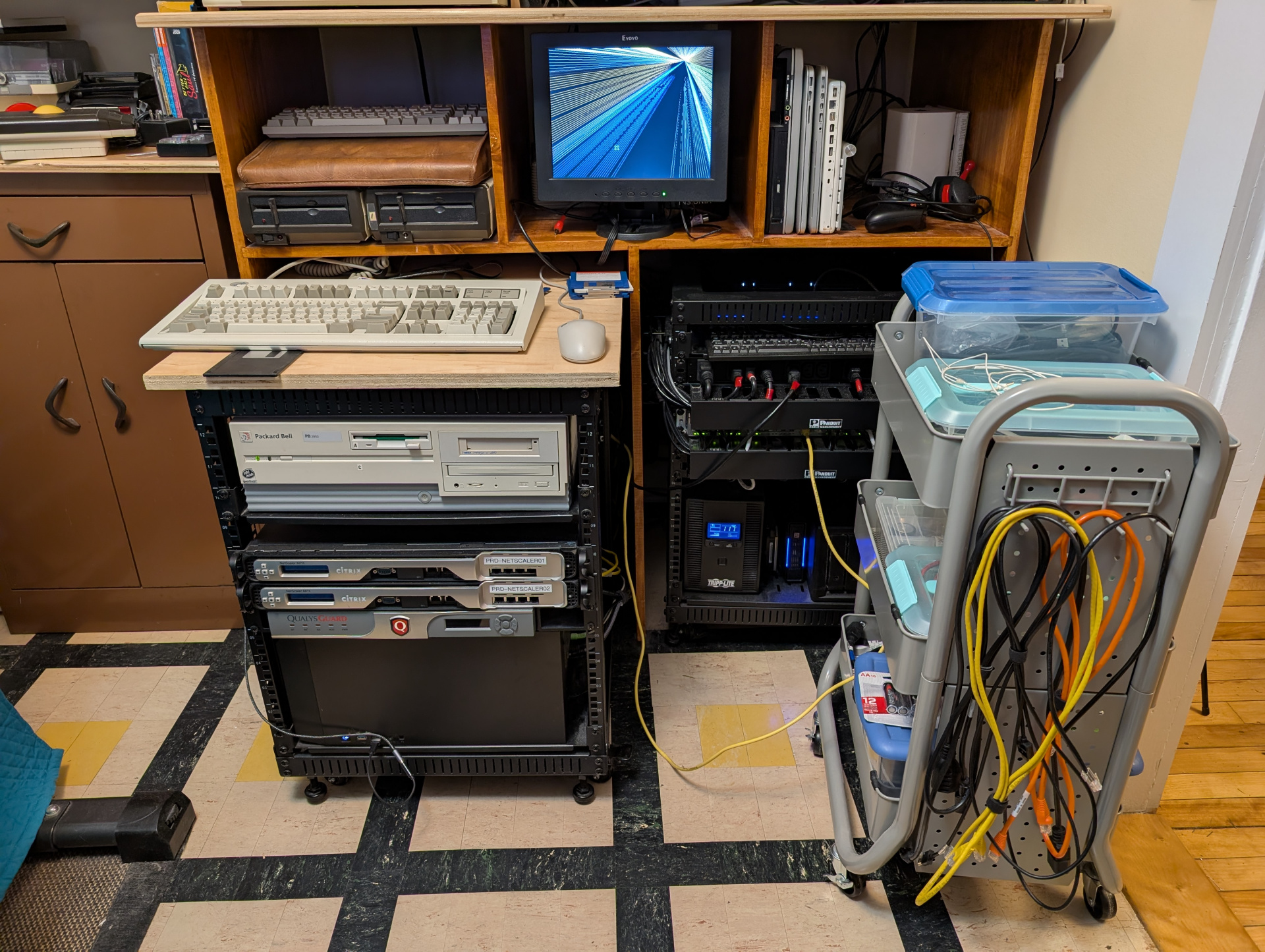
I made a quick tour video for an audience of about four. Here's a brief look at the basic stuff in my office, much of which I will do better quality videos about soon. Maybe like a monthly VAST/SPACE meeting? I dunno.
Enjoy the 1992 aesthetic. Pretend it's a VHS-C tape or something you found at Goodwill.
Update: I didn't notice the screensaver during the whole desk part until uploading just now and it's my favorite thing ever.
Sinéad O’Connor - Jerusalem (AKA the nice lady who was right about near every goddamn thing)
I'm running this setup to backup some Atari ST 720K floppy disks I have. I'm interested in backups of BBS newsletters and general BBS/Early-Internet ephemera from the '80s and '90s and I'm finding cases where at a glance I can't find that specific copy of like STReport or whatever on the Archive. Also anything fun related to the specific Atari club we were all members of since this is likely the only copy of any of that.
I'm very happy with the roll-away desk surface on top of this rack:
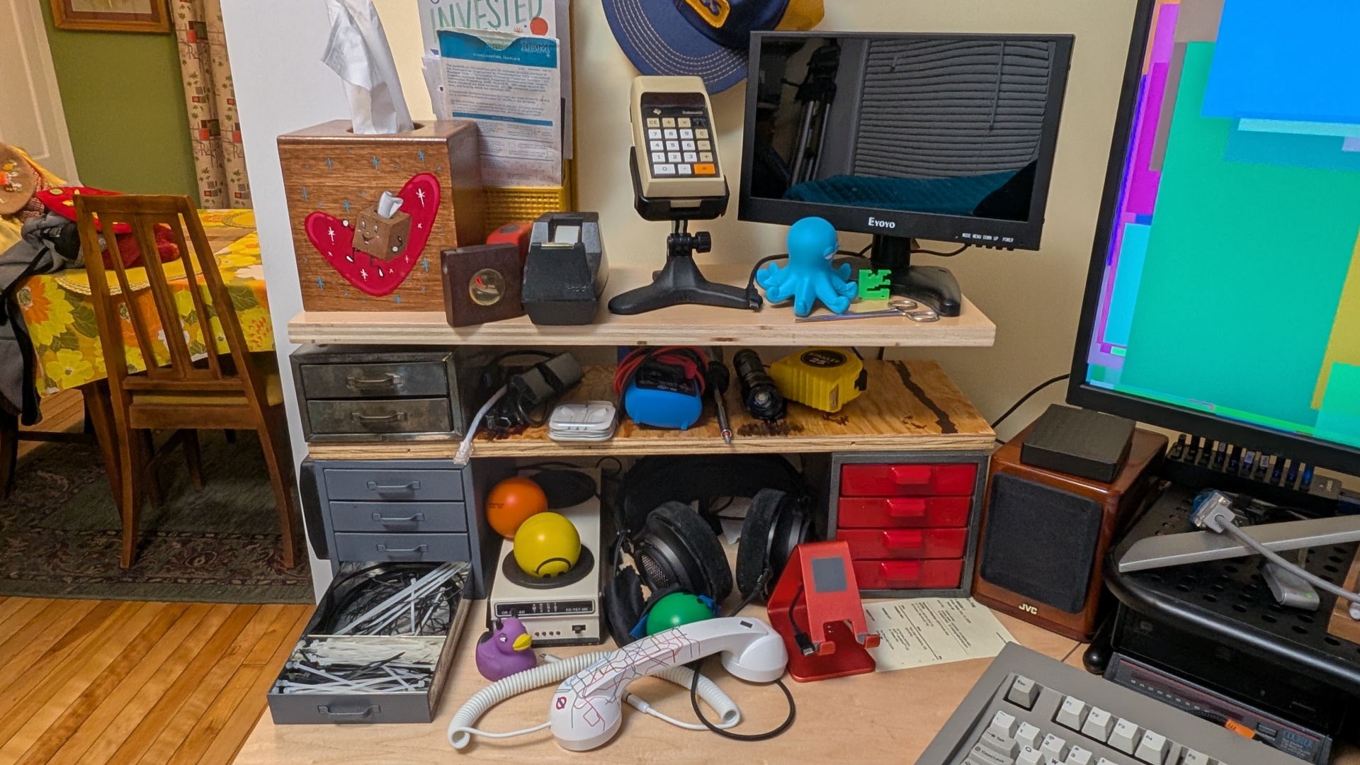
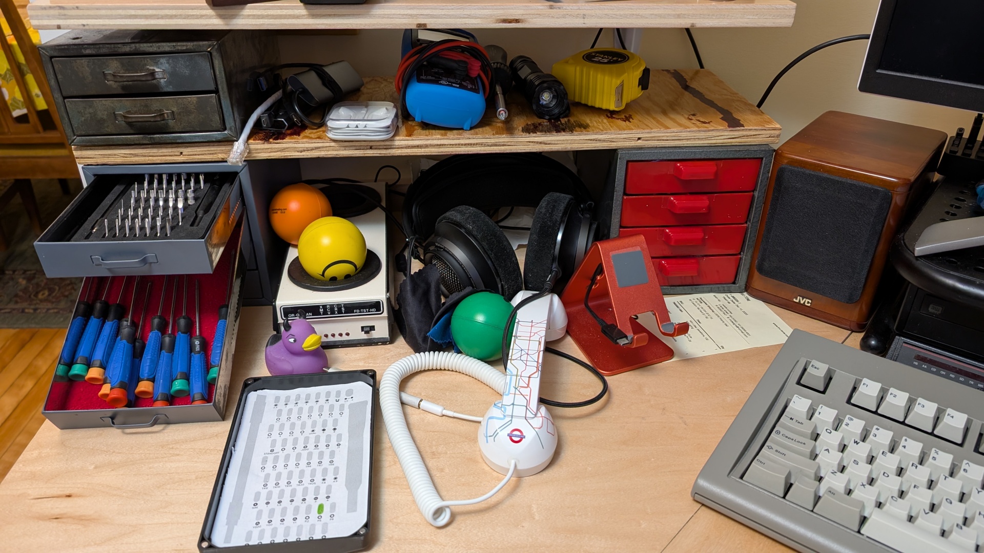
My friend happened to give us a 4 drawer grey parts bin so I decided to build some shelves and an easier to reach space for all the day-to-day rack screws and fasteners, Velcro, dinguses and connectors and whatever.
I'm transitioning my mindset from a fully-stocked laptop bag ready to go with all my stuff to that of a more stationary workbench because I will rarely have to just "get up, grab my bag and go" like I could have to do now. I can even just reach that TI calculator and do the calculation faster than I can go to the KDE menu and launch kcalc on the rare occasions I need it.
The answer is absolutely almost never "zip ties or twist ties". That's why the top two drawers are just Velcro.
This on the other hand is just over the top wasteful storage hubris:
Unfortunately the drawers are exactly too shallow to have the cover with handy glued-in map on the iFixit kit, but luckily it sticks to the side just fine. You know iFixit has PDFs that print out to exactly fit inside this screwdriver kit, right?
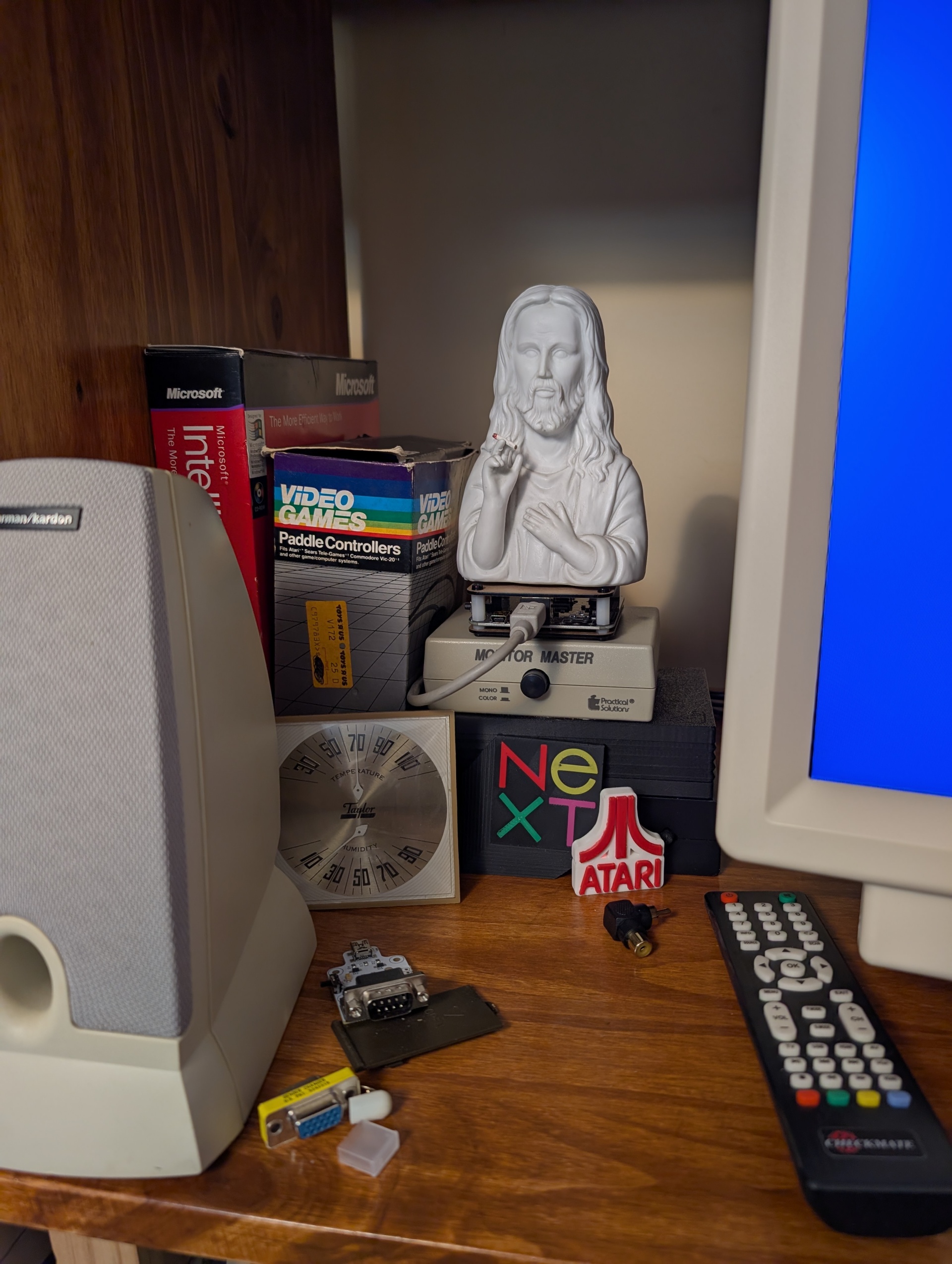
Just yesterday I wrote a whole thing about how I feel bad for sounding like I'm trashing this monitor, when in reality I haven't actually used it as a monitor for more than a few minutes total. I really want to express my admiration for Steve and his project.
After spending a day with the CheckMate I have decided that it's going to change my workflow in a big way and reminded me of the Real Use Case for this thing.
I've had a CheckMate IPS monitor for quite some time and it's shown up in some pictures, but I haven't really mentioned it and given it a real objective look yet.
I have lots of thoughts so far but it's very early days. I've basically been super frustrated trying to get my target and admittedly "niche" use cases (NeXT Monochrome, Non-Composite Atari ST) to work and haven't really taken the time to look at how the actual monitor functions.
Far East keyboard vendors "are defining the lower end of the market, and I wish them a lot of luck, but we offer a better membrane keyboard, with better tactile feel, and a lot of service and market support here in the U.S. We offer Cadillacs, and are not the cheapest guys in the world."
- Lexmark's manager of market development Dick McCall regarding falling keyboard prices in 1993, just after spin-off from IBM
I recently bought a new Model F SSK. I've always felt bad for my role in The '90s Purge, wherein if I had a dollar for all the models M and F that ended up in a dumpster...well I could have put a down payment on a mortgage for a new modern Model F :-) I am not, repeat, not knocking the price. It's actually quite a value if you consider that a Model M sold for hundreds of 1989 dollars (MSRP direct from IBM anyway) as the cost-reduced, slightly crappier replacement for the F. It's also a labor of love and I like to support these sorts of projects. It's /incredibly/ well made and is just an absolute monster.
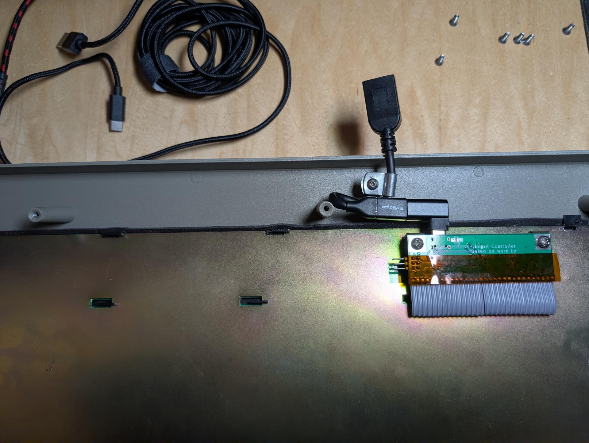
Aside from some initial glitchiness with a couple of "iffy" flippers and springs, we got it up and running relatively quickly. Definitely get the First Aid Kit, in fact I'll probably get another just to have it. The only modification I made from the default was to remove the fixed USB cable and replace it with a USB-C M -> USB-A F dingus so I could just swap it with my normal keyboard cable.
This steel & aluminum Model F also makes a Model M feel like the toy at the bottom of the Cap'n Crunch box.
Witness:
The model f ssk is pretty pingy but is a total pleasure to type on. My cow-orkers are lucky I didn't haul it down to our 3 day on-site meeing or they'd have tried to murder me in the first 10 minutes. Luckily it doubles as a weapon so I'd have been just fine.
See. The model M sounds like and feels like a children's toy by comparison. IT'S WHISPER QUIET!
Working in the computer store in the '90s I always loved the Model Fs we had around and tried to use them as bench machines, but they were /just/ that little bit too oddly laid out to be useful. So I heaved 'em. Lots of Model Ms too, and 5150s...yeah yeah. Progress. How was I supposed to know I could have made a lucrative career out of making videos about the crap in the basement of a computer store 30 years later?
I like the Model M keyboards I've got, but without fail a couple of weeks into using one my hands start to hurt and I worry about "This is it, after 40 years of this shit I'm finally getting some kind of RSI nonsense". Then I switch to a Keychron and everything is better after a day or two. It's weird because my natural tendency is to kind of hammer on keyboards, or at least I feel like I do, what do I know.
The F feels a lot lighter while typing even if it sounds much more violent. I haven't had any strain yet.
Verdict: Get one! They're Great! - As long as you don't mind maddening frustration when you assemble the whole thing and a single goddamn key won't actuate so you have to take all the caps back off and rip it apart. Not that I had to do that several times. Honestly I wasn't going to get this because I knew from reviews that it shipped without the keycaps and it looked irritating and fiddly to get it going (and I was right!) but Natalie talked me into it. I'm leaving the "locking" tab bent open since like, is it even possible for that backplate to slide? Time will tell!
Again, none of that is a knock on the manufacturing of this thing. It's /great/ and I'm sure it'll last me until I die. I just know my limitations and that I have a very low tolerance for frustration since I've been abused and burned by work for far too long and as such have no patience for friction unless I'm being paid. I don't care how much fucking hacker-chow gets in there, these keycaps aren't coming off to clean or anything unless I absolutely have to.
I was certain that one of Thomas's videos on the modern Model F showed the key assembly process, but I can't find it. Enjoy anyway.
I was watching this Adrian Black mass ST testing and it's just funny that they basically just all worked more or less. He said the same thing about the Atari 8-bits about how if your power supply was good they're more or less just going to work vs all the problems with commodore 64 and Amigas.
Too bad he's not really gonna get much content out of that whole pile!
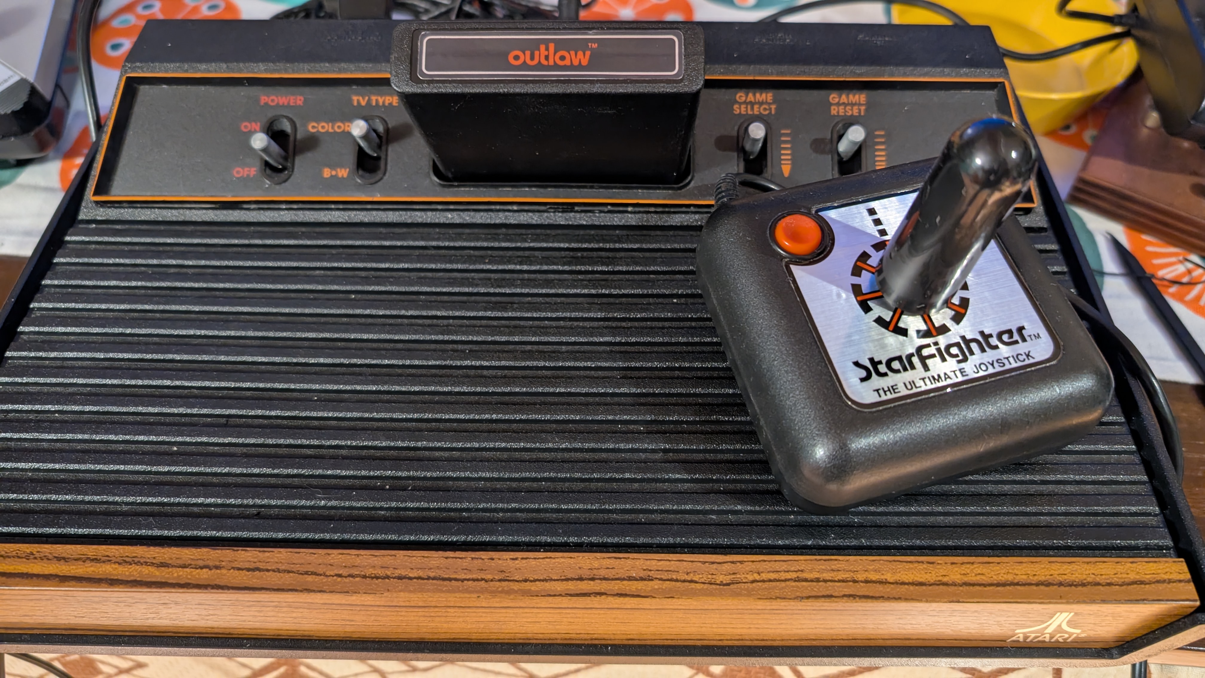
The other day I found a Suncom Starfighter joystick in my projects bin labeled as "needs repair, right and down only". I tested it and sure enough Up and Left didn't work at all unless you really push which I was unwilling to do. This isn't a joystick I ever had when I was a kid, but it's a real tank. It's the exact same internal design as the Tac-2 and other Suncom sticks. I definitely see why the Tac-2 is more popular with the much cooler ball-capped shiny metal stick. I remembered seeing Jan Beta repair one of these and went and grabbed that and a few other video guides.
Well look who is making an appearance on my bench, finally.
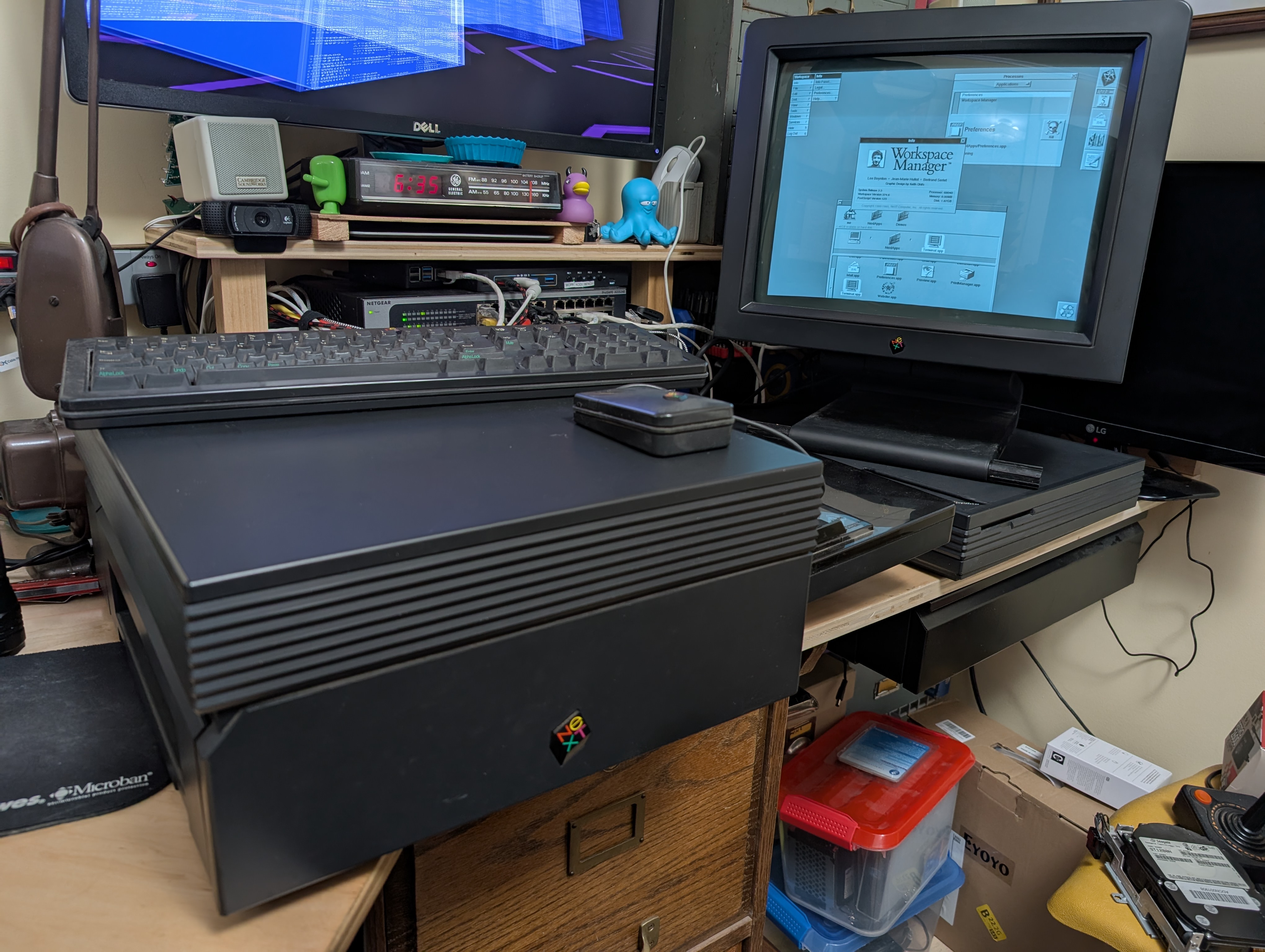
I was given this monitor and printer (!) last year by a coworker who used to work for NeXT back in the day. "Just get a slab" he said. "It'll be fun" he said.
Like everyone my age I've lusted after these things since 1989, but I'm also not Dr. NeXT, so there were some bumps. I found the Wombat USB -> ADB dingus that proudly Supports NeXT (fine print... very few NeXT machines have support for ADB) and so I bought a 25Mhz 68040 NeXTStation.
Unfortunately this was not one of the vanishingly few machines that supports ADB, so I was out of luck there. I kept trying to mash my Mac keyboard in until I finally actually looked at the connector. Ah well. $300 later and now I have a non-ADB keyboard and mouse. Which of course can't just plug into the NeXTStation itself. They have to go through the monitor. This is also a first-gen monitor of the type that can't be turned off, so they just burned themselves up. I do look forward to building a Non-ADB to USB dingus using the guide I found via forums, which appears to have been taken up by Adafruit.
After getting the keyboard and mouse up and running I took out the blank 200MB drive and replaced it with a BlueSCSI with a NextStep 3.3 image. I am able to get the machine on the network and pinging Internet hosts. However the Terminal.app seems insanely unstable at least on the OS image I am using. And once crashed it just can't be made to come back at all but just goes into a "launching" state in the Processes app. Know what'd be nice? Virtual Consoles. Just saying. I wonder if there's not a better PID based process viewer that can show me stuff outside my user session.
I'm basically just trying to FTP down some software to use and it's not going /super/ smoothly. But it probably is an accurate representation of the experience I'd have had as a user in a lab in 1992 or whenever.
But the party piece is that printer. That's why I'm here. And I'm happy to say it probably is capable of working. The machine sees it no problem but if I try to print I get a "Printer Door Open" error, which is a lie. It looks like there are three possible switches that get activated when the printer lid is closed, and they all seem to be fine, so this might warrant some further investigation. That is unless I just don't have the right cable since I also learned today that the "high speed serial cable" from the 68030 is not compatible with 68040 machines. So that's nice.
I can't even get my head around how rare these printers must be though. It's estimated that NeXT sold something like 50,000 workstations. My guess is most of those went to university labs and scientific installations (CERN, DUH!). Those places would have had print spoolers and maybe like 1 printer per room full of users. I can't imagine they sold more than a couple thousand of these printers and for such a minty fresh example to fall on me was just super lucky.
Whatever, I'm $1000 into this project and there's no stopping me now! Next up is to get a modern "Soundbox" replacement which will give us VGA output and a non-ADB keyboard port so we can retire the actual CRT into "Sit over there and Look Pretty" mode.
Thanks again so much Andrew for the project, and it's definitely gonna continue to be a project! Of course my goal is that this machine should work as a print spooler for my network. At least for a day or two before the power bill drives me into debtors prison.